-
The Fifth Child covers
The project initiated by Mr Cadilhac and the lycée A. Einstein is really interesting!
The pupils had to imagine their own covers. Here are their works! Excellent!

Cover designed by Clémentine B, Clara R & Sana E
Their Analysis:
We chose this photo to represent the cover because the character of the Fifth Child is showed very well. Indeed, in the back cover, it reads that the child, Ben, is monstrous in appearance. In this photo (which is extracted from a film called The Orphanage), the child on the right hasn’t got a face, he is frightening. Moreover, we can say that the woman next to him is Harriett Lovatt. She is holding the hand of his son, so he seems to be brutal and uncontrollable. They are only two in this photo; it reinforces the feeling of loneliness: the others can’t understand their situation, so they have to fight against it alone. The colours are dark, especially grey and black. The atmosphere is cold, tense, and we can notice that their clothes are old and drab. The mother’s face shows feelings of sadness and powerless.
Cover designed by Lucie F.
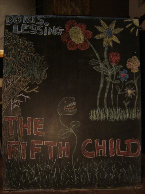
Cover designed by Louise P, Juliette S & Théo N
This drawing is our cover for the 5th Child, written by Doris Lessing.
In the middle of the picture, there is a carnivorous plant which seems to come from hell. It has got seven big sharp teeth and a huge tongue. It has got only two leaves. It is surrounded by weeds. In the top right-hand corner we can catch sight of a sun. On the right there is two huge flowers and four other little flowers. The two bigger flowers look at the carnivorous plant. One is red, the other is yellow. The third flower is a tulip. The three other flowers are blue and white. On the left there is a high tree. In the foreground, there is the title “The Fifth child”. In the top left-hand corner, it’s written the author’s name. The background is deeply dark. The weather seems to be stormy.
The flowers in the top right-hand corner represent the family (with the parents and the children). They seem to have a peaceful life under the sunshine light contrary to the fifth flower which is growing far from his family in the weeds and the darkness. It’s to show that nobody wants to live with the fifth child. Maybe nobody likes him because of his personality or his appearance. That’s why he looks like a monster. He is in the middle. The right could be heaven with his family and the left could be hell. He lives between hell and heaven. He can’t go to hell but he hasn’t got the right to go to heaven.
I chose to draw the fifth child as a carnivorous plant because it is said that he as got a monstrous appearance and he is insatiably hungry and strong. So, compared to his family which I represented as a couple fo flowers under the sun, he is abnormal and frightening. SO I thought that comparing his family with flowers would be interesting and original.
 Tags: cover, their, child, are, photo
-
Comments
A blogstorming experience that will blog your mind


